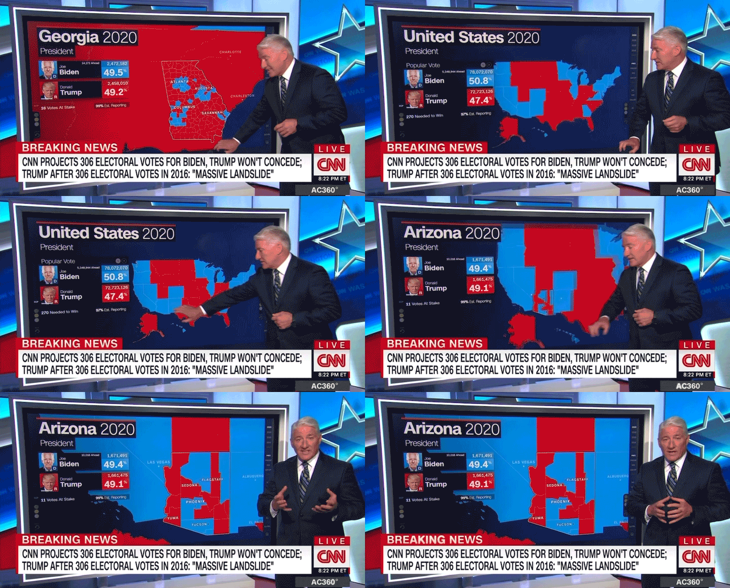
We talked to the producers and designers who upload the data and create the graphics that power the Magic Wall to learn how the technology has evolved over the past few election cycles — and what new features we can look forward to seeing on Tuesday.
Here's a portion of our conversation, edited for length and clarity:
The Magic Wall made its debut in 2008. What was that premiere like and how has the technology changed since then?
David Reisner, senior producer: This is before people had iPhones in their pockets, right? So this was unheard of technology at the time, coupled with trying to program this visual storytelling of very, very dense, heavy data that we've been familiar with for years — but created in such a way that it was interactive and an extension of John King's vast political knowledge at the time. So the question was, how do we break down the brain dump of all the knowledge that he has? He was able to call out a primary in Cuyahoga County in the '80s like that (snaps), now we can just quickly click that and show the world how that visually is compelling.
John Murphy, senior producer: One example would be what we call replay mode. Before 2020, the wall only showed the latest vote counts. In 2020, between the pandemic and the order that votes were being counted, we knew the results would take longer than usual and states could flip from red to blue or vice versa depending on whether states counted mail-in ballots or in-person ballots first. That created the so-called blue mirages and red mirages. We needed a way for the wall to go back 24 hours or 48 hours to show how the counts had changed and explain why that had happened — so we built a system in about four weeks to do exactly that.
Pallavi Reddy, senior director: The challenge is making sure that we're keeping up with the storylines and the politics of of day. But at the same time, there's a simplicity in that. The Magic Wall doesn't change; it will always show you election data and facts. And that's kind of what makes it really a powerful part of what we use for election night. Regardless of what kind of noise is going on in the political sphere, it's just always about election data and where it stands at the moment and how to inform our viewers using that exact data and nothing else.
How is John King able to access so much historical voting data in the Magic Wall?
Billy Holbert, senior producer: We always like to say that if John King were a jazz player, this is his instrument. We create this tool to keep up with him and to be one step ahead — that's our challenge, always. So the presidential data in the tool itself goes back to 1980. We can show you where and how people voted for Jimmy Carter or Ronald Reagan, down to the county level. In 2014, all this had to be converted and uploaded manually. Pallavi and I spent quite a while on this, getting carpal tunnel along the way.
Caroline Tounget, producer: We bang on just about every piece of what this Magic Wall can do — and maybe then some — so we know that we have done everything John may do before it gets to him in front of the cameras.
What are other things, besides current and past voting tallies, that the Magic Wall displays?
Tounget: There are things called "demographic layers" that we put in the Magic Wall during the 2020 election to show not just demographics — like where like the Black or Hispanic voter population may be — but also things like where Covid concentrations are really high and how that data have progressed throughout the months.
Anything new that we should expect to see on Tuesday?
Lauren Holt, producer: A big thing that we've been spending a lot of time on this year is that there's a completely new redistricted (congressional) map because the census underwent a recount. So a cool new feature that will be great in this redistricting year is our congressional district by county tool. In every House race and every district, John (King) is going to be able to dial in and then break that down even further into smaller pieces — which is county level.
Unlike any other year where you would just sort of see a single color representing the candidate in the lead, you're now going to be able to see a county breakdown of who is leading in which county. That gives a much more contextual look at the results rather than just the two top line numbers.
How would you like to evolve the Magic Wall technology in the future?
Holt: There are so many stories that are rooted in data, and the Magic Wall's capabilities can be applied outside of elections and politics — whether that's climate-related or economic- related. The world very much runs on data. I think a lot of people realized that in 2020 when Covid happened and everyone all of a sudden became very aware of the CDC's data visualization dashboard.
Reddy: I would love to put this in the hands of our viewers so that they can watch John King or Phil Mattingly on election night at the Magic Wall and they can also drill down into the storylines that matter to them as viewers. You can go and get that information yourself and be your own John King at home.
This isn't a touchscreen technology. This is data visualization. The more visualizations that you can apply to data, the better our reporting will be, the better our data analysis, the better context we can give our viewers. And then the more we can put that in the hands of our audience — digital or TV or whatever — the better it is for all of us.


Đăng nhận xét